“Traveling — it leaves you speechless, then turns you into a storyteller.”
- Ibn Battuta
INTRODUCTION
Seascape is a user-centered ferry booking and sea travel app designed to improve the way users discover, plan, and experience maritime journeys. This project addresses key user pain points such as difficulty in accessing real-time ferry information, inefficient booking processes, and lack of accessible, intuitive interfaces for diverse user groups.
BACKGROUND
The application is a platform that enables users to book and travel by sea seamlessly.
PROBLEM STATEMENT
There is a significant lack of intuitive booking platforms that support sea faring making that service very inaccessible for alot of users.
RESEARCH & USER INSIGHTS
The goal was to directly connect with our prospective end users to ascertain their painpoints. An interview was conducted with all the selected participants to individually to avoid group-thinking or the bandwagon effect.

As I built the product from scratch, I sought to gather user insights, preferences, and expectations to craft a robust offering that surpasses their anticipations.
VISUALISING THE LOGO

I crafted a logo that subtly reflects Seascape’s essence, ensuring users intuitively connect with our product. The logo concept offers a whimsical depiction of a boat viewed from a dynamic 45-degree angle, complemented by a clear and easily readable typeface.


CREATING WIREFRAMES
I crafted detailed UI wireframes to illustrate the app's structure, navigation, and key interactions, ensuring a user-friendly and intuitive design.

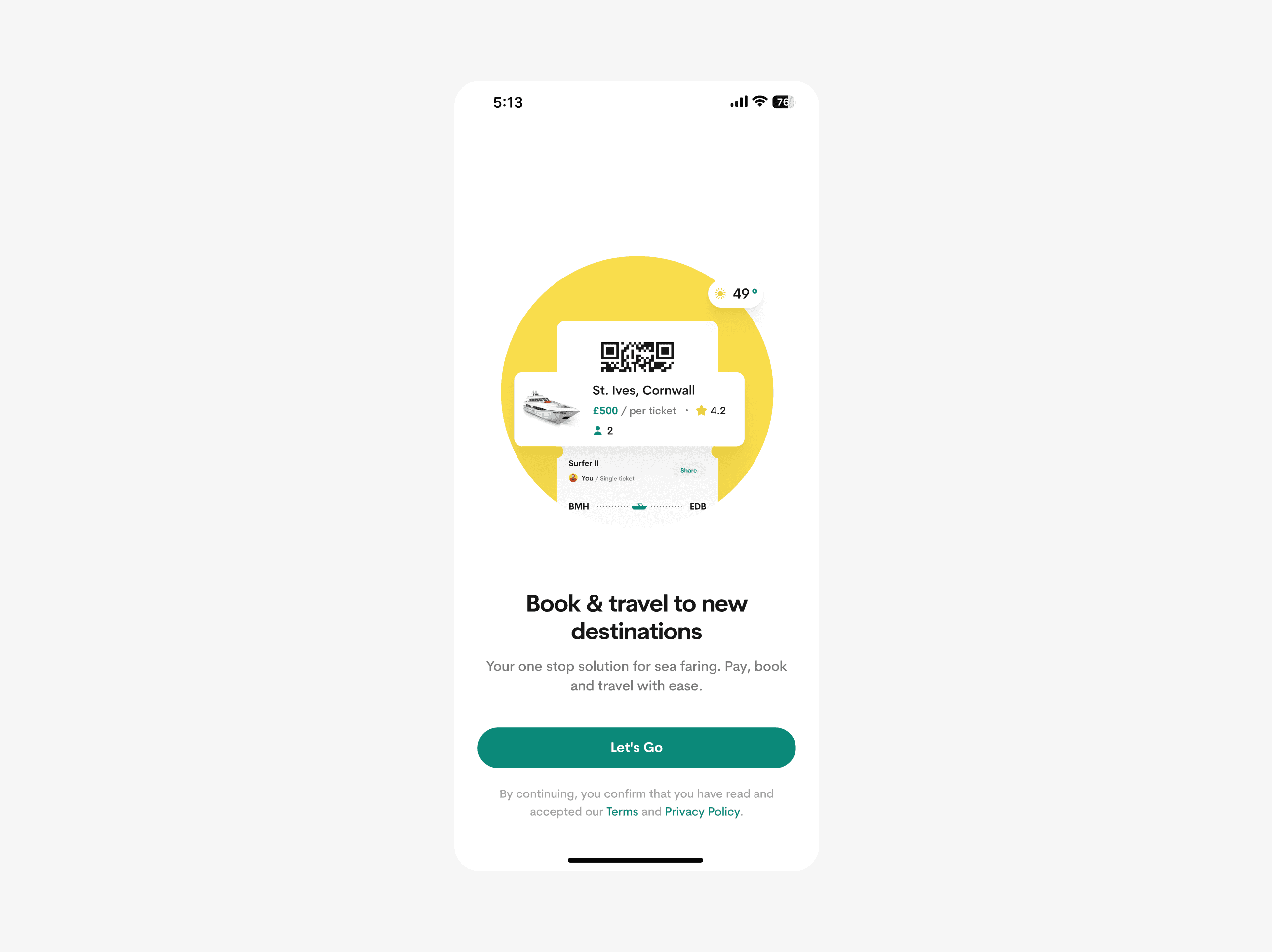
User onboarding
The onboarding page was designed to be simple and straightforward, swiftly introducing users to the product and its functionality. Users are prompted to provide essential biodata details, like email addresses, phone numbers, and full name.


Users are immediately encouraged to enable notification reminders during signup to ensure they are always updated about their trips.

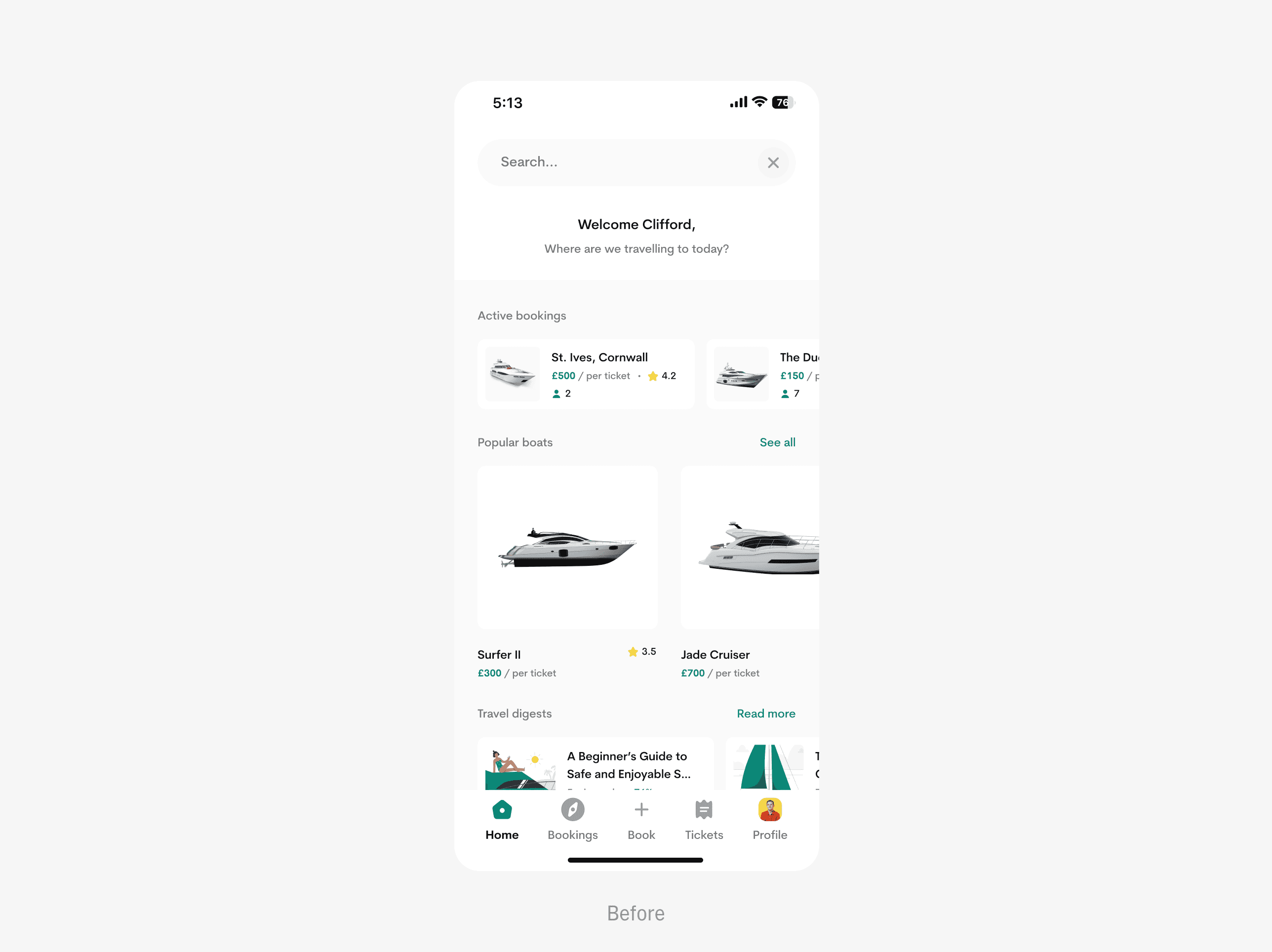
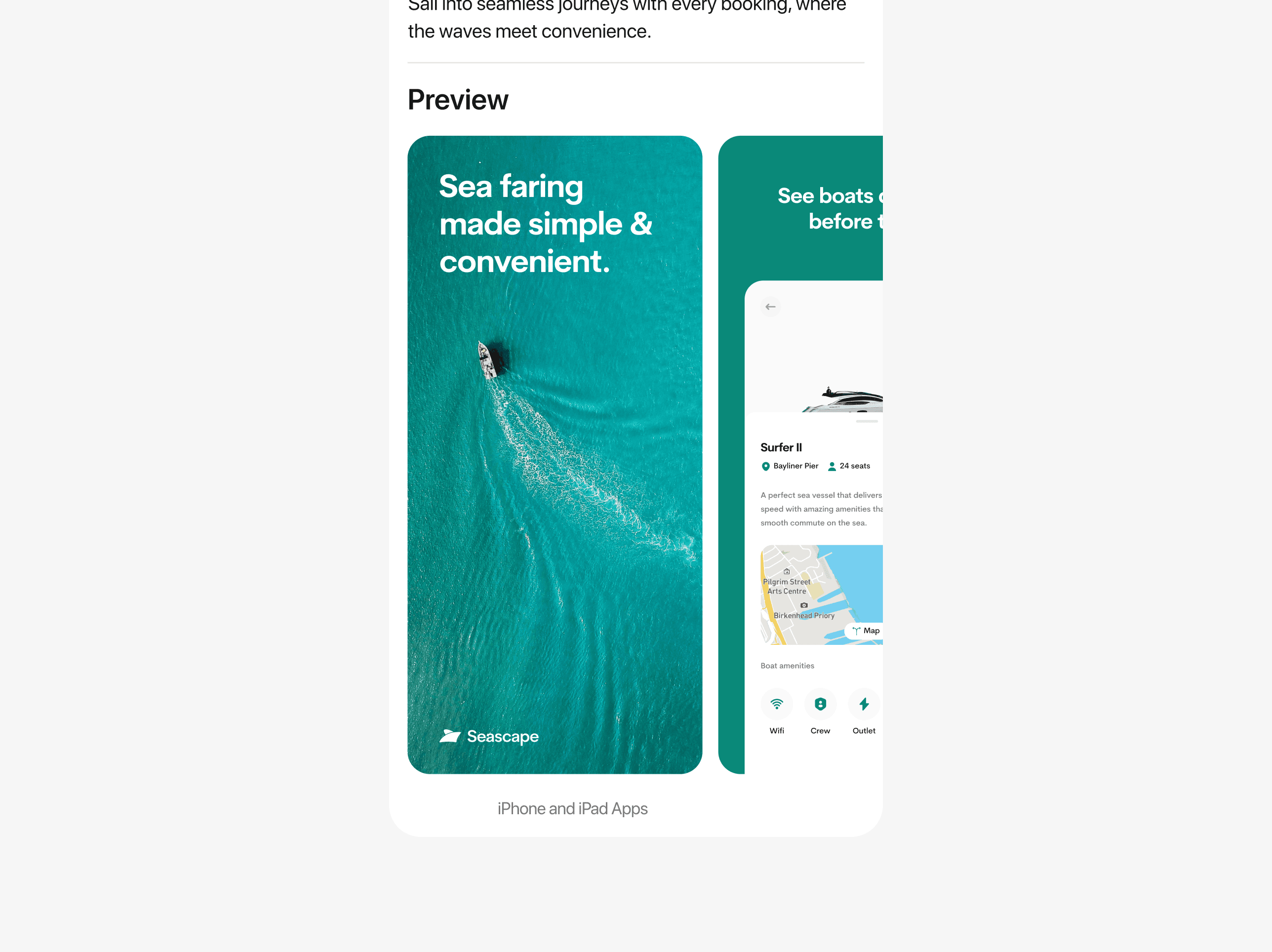
Home screen
The home screen underwent meticulous design, offering users essential features with an intuitive navigation system, complemented by a convenient hamburger menu for additional options.

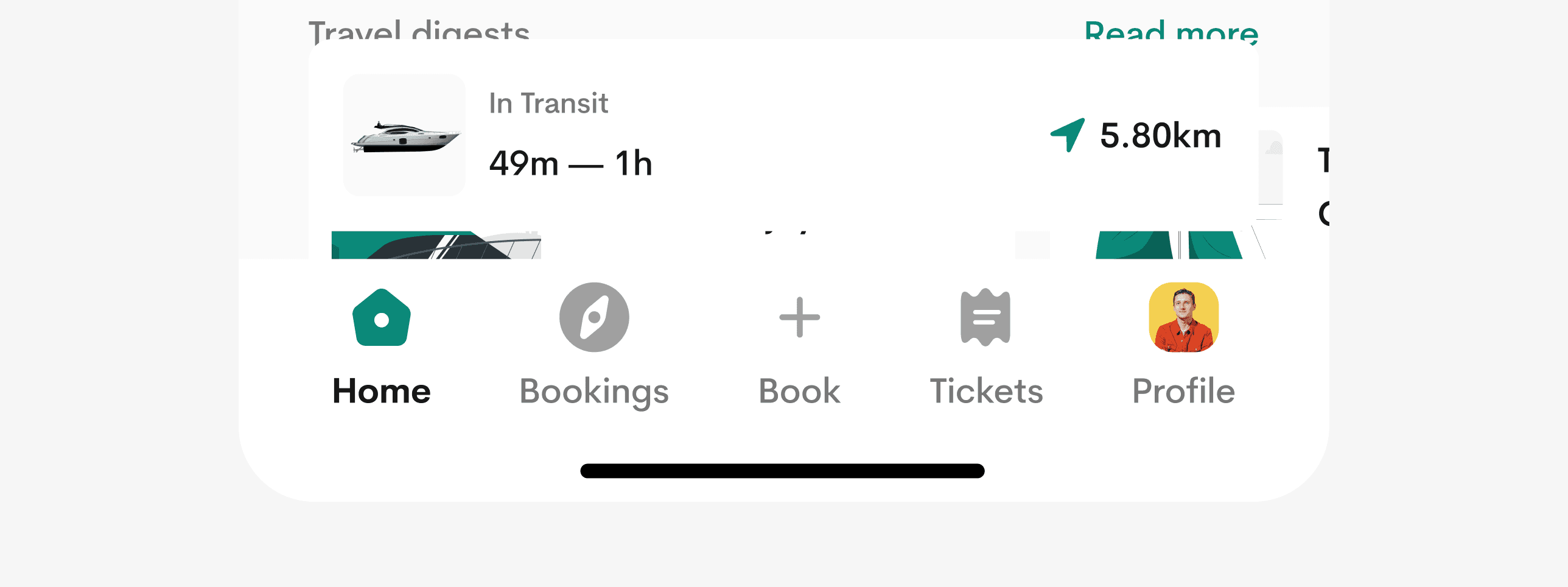
I made an intriguing decision to prominently display active bookings on the home screen, ensuring users are continuously reminded of their upcoming trips and pertinent details.

Travel digests, or reads, offer users bite-sized educational content and articles.

Dive into a world of sea travel, encompassing safety tips, life hacks, and expert guides curated by Seascape and its stakeholders.
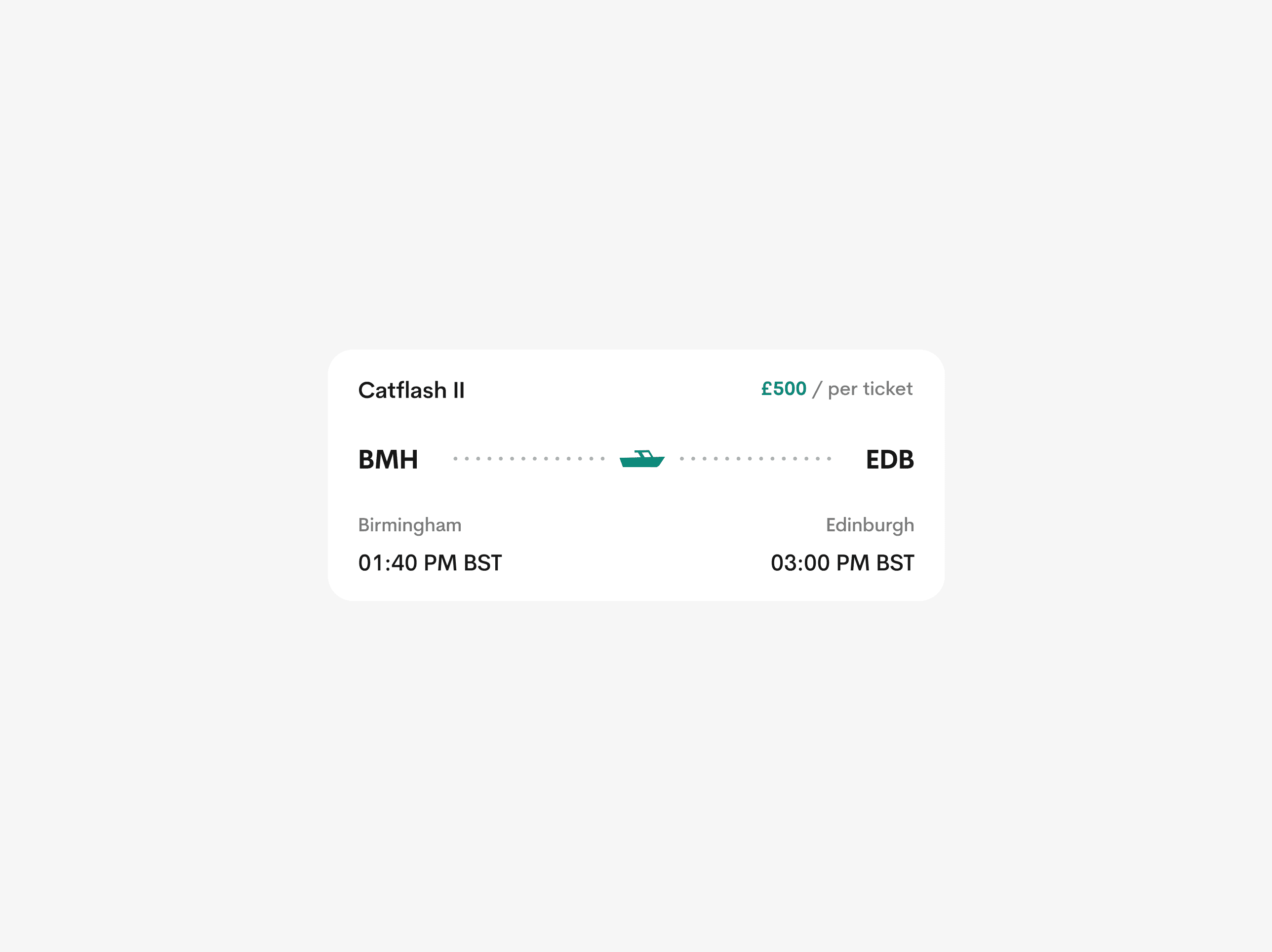
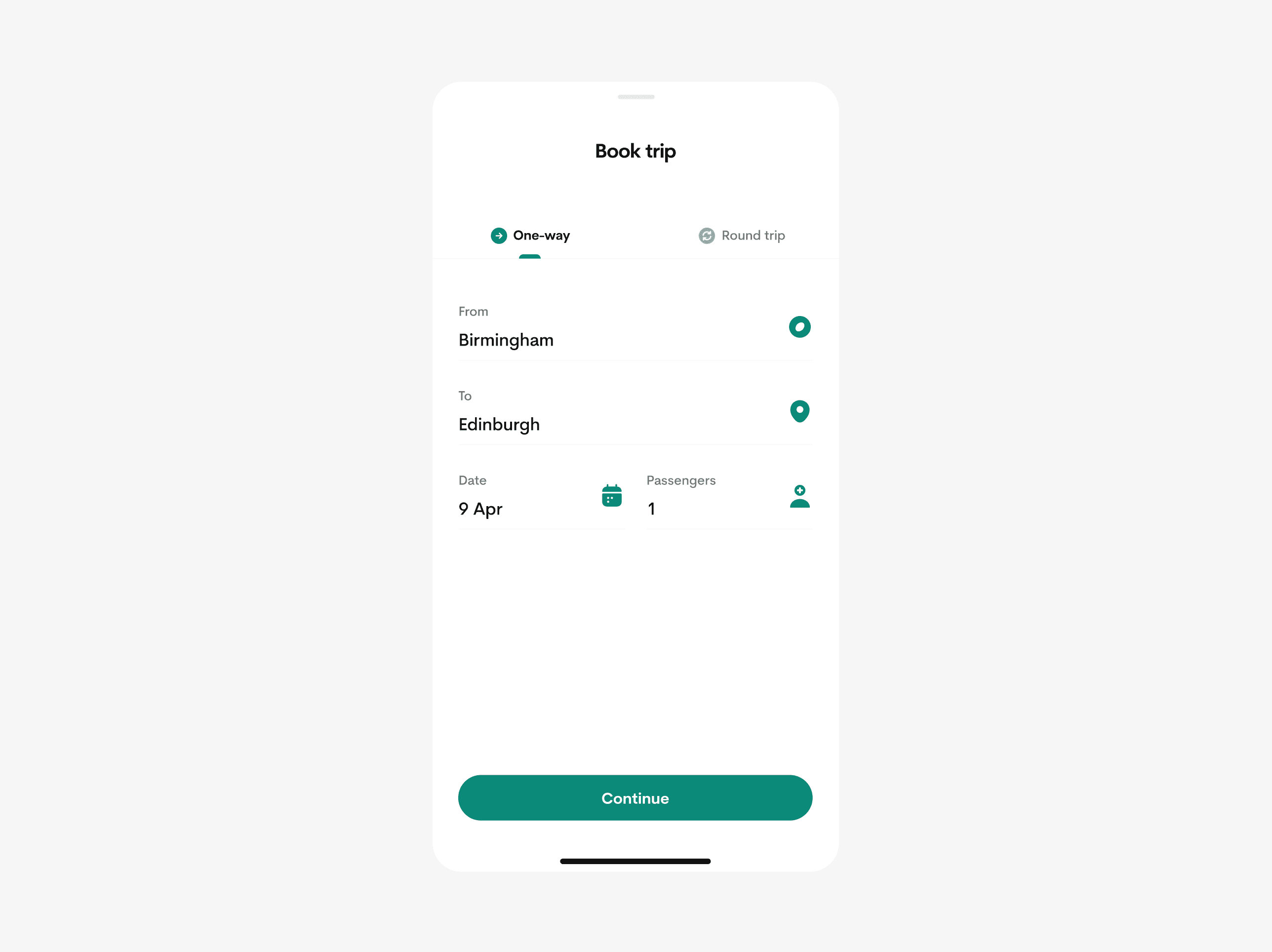
Booking a trip
The booking process is very simple and straightforward. Users have access to view trip details, map direction, boat amenities and much more.

I provided a simple checkout process with the ability to select payment types with saving cards feature which makes consecutive checkouts more seamless.


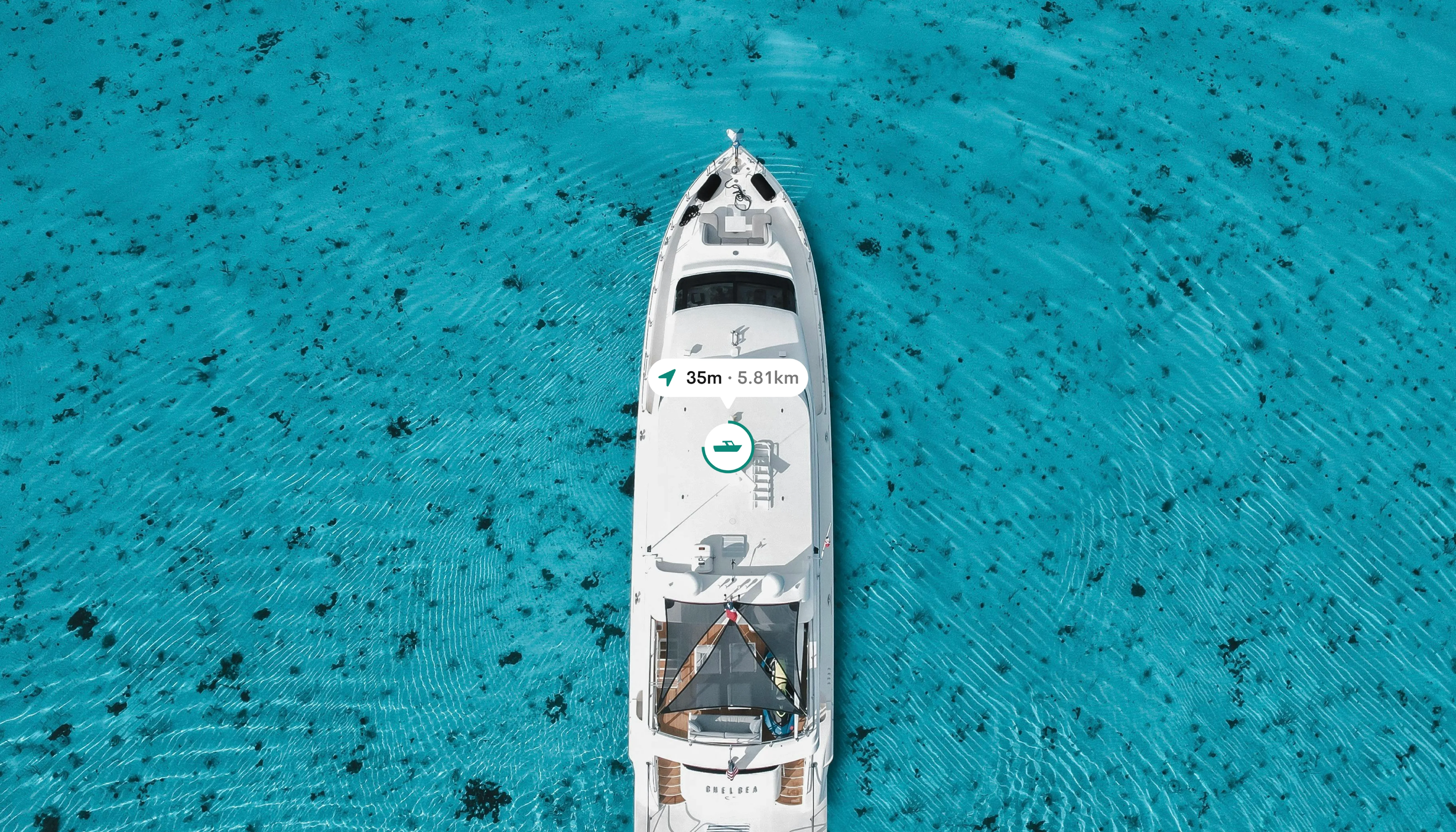
Keeping track of your current journey
I created a thoughtful feature called Journey tracking, which offer users additional insights into their ongoing trips, including travel time, estimated distance, and boat details. Users can effortlessly share their live locations with loved ones, summon stewards, and delve into engaging travel digests throughout their journey.
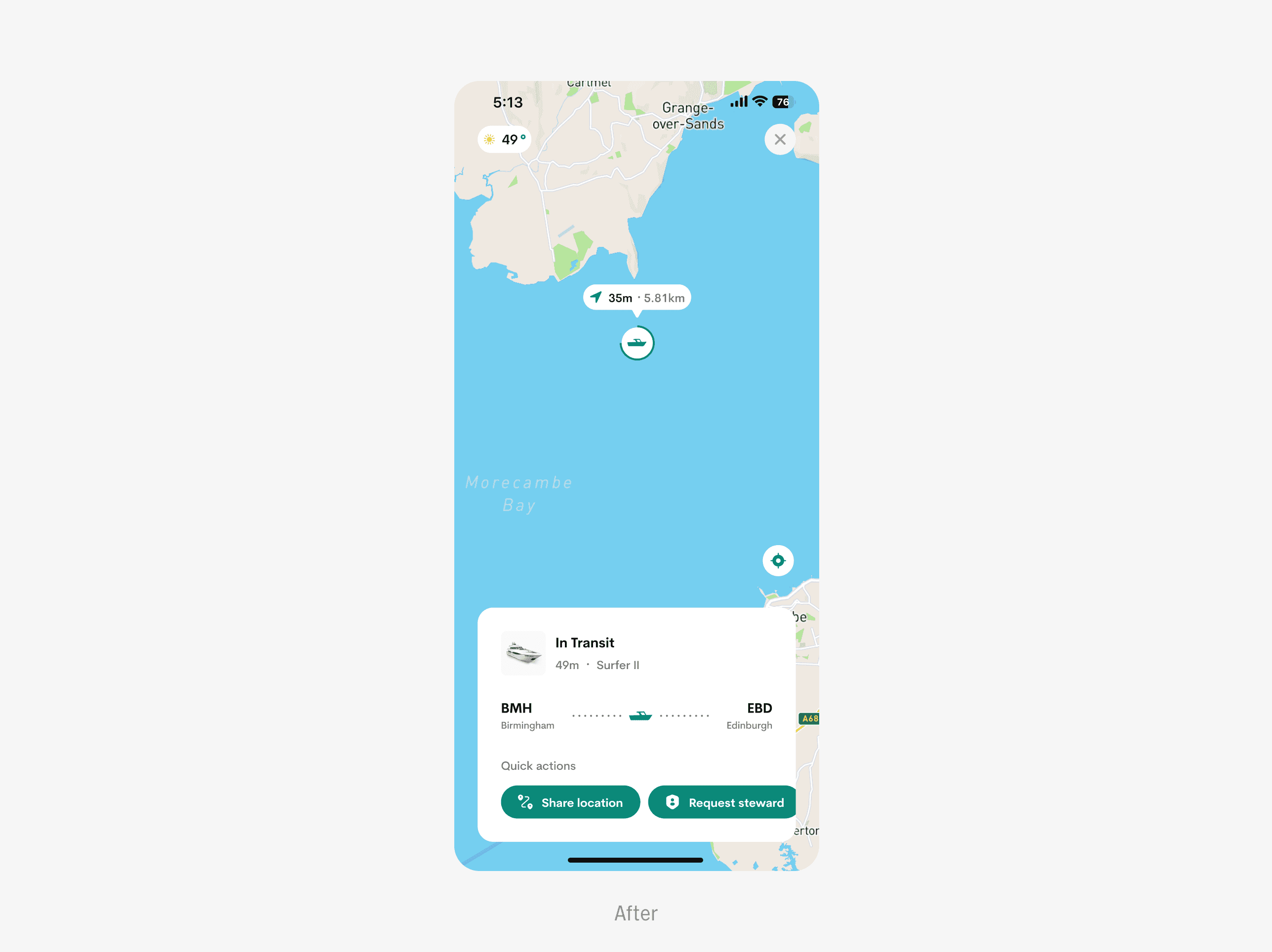
VISUAL DURATION FEEDBACK INDICATOR
The miniature boat dynamically adjusts its size, inversely proportional to the trip duration, while also displaying estimated time and duration on tap.

APPLE DYNAMIC ISLAND INTEGRATED
I strived to enhance the user experience with Seascape, focusing on personalised interactions. With seamless integration with dynamic island, users stay informed about their trips, even without the app open.
Usability Testing
The primary goal of the usability test was to ensure the app seamlessly aligns with our users' needs, delivering a deeply satisfying experience. I conducted this process using Maze.

STUDY OVERVIEW
I spearheaded the Usability plan for Seascape, overseeing its execution over a 3-day period.
I welcomed participants, explaining the study's objectives, and closely observed their behaviours & micro-reactions as they navigated through each task. We ran the testing session over Google meet.
KEY PERFORMANCE INDICATORS (KPIs)
I utilised several key metrics to gauge both the effectiveness and user-friendliness of the product.
TASK SUCCESS RATE
I measured task success rates across various user tasks, setting the KPI for this metric at a minimum of 65%. Remarkably, the actual success rate averaged an impressive 91%.
USER SATISFACTION
I gauged user satisfaction via a 5-point Likert scale (1 - Very Dissatisfied to 5 - Very Satisfied), aiming for a KPI of 4.5. Remarkably, the actual average rating surpassed expectations at 4.6.
TIME TAKEN ON TASK
I established the time on task KPI to ensure tasks were completed promptly. Efficiency was gauged by adherence to designated time limits.
See full reports on the behance case study.
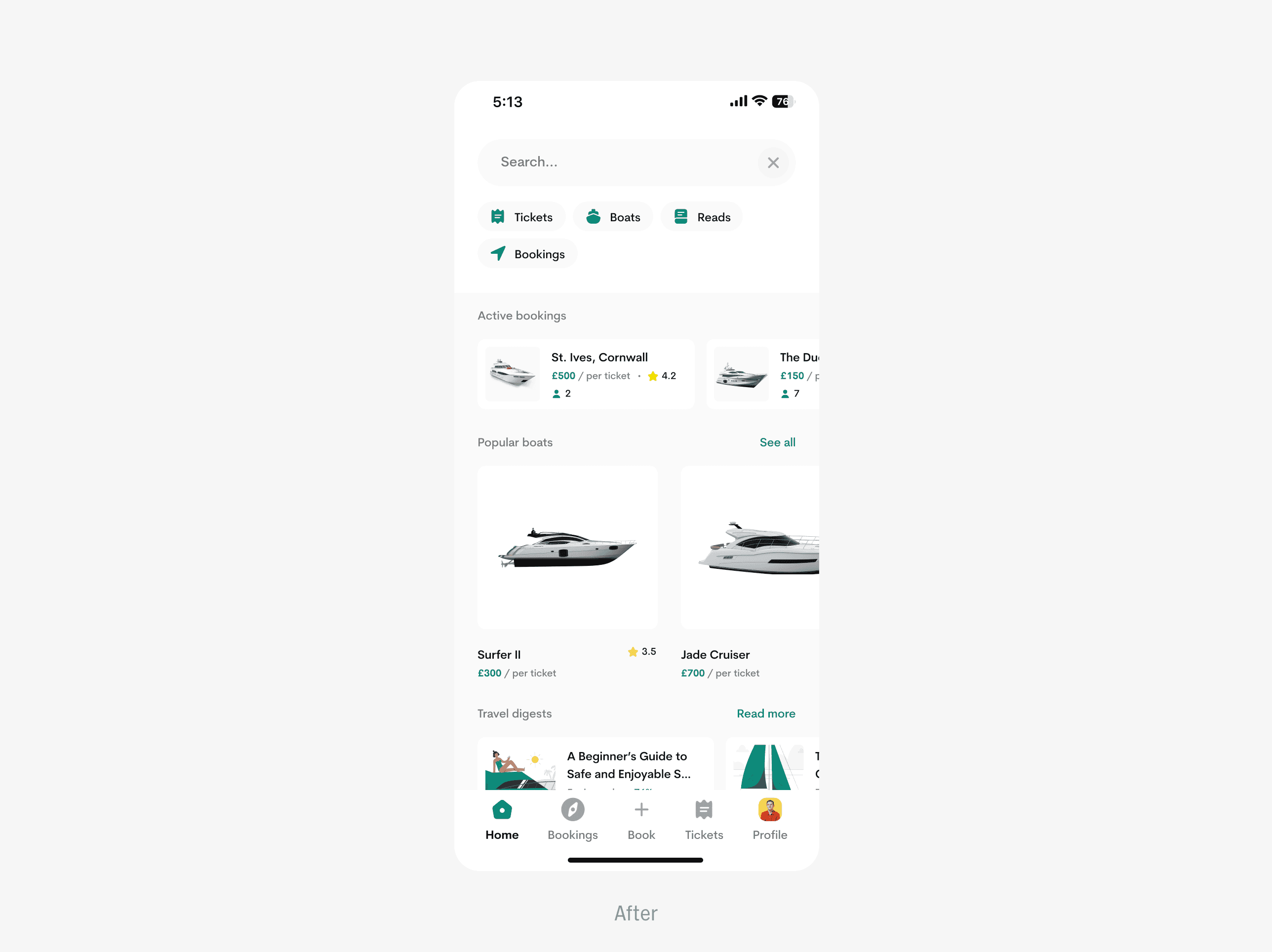
Solving UX Problems
I compiled the reservations and recommendations gathered from users and customized them to meet their individual needs.
REDEFINED SEARCH EXPERIENCE
I empowered users to elevate their search experience with customisable filters that refine results to perfection.
IMPROVED JOURNEY TRACKING EXPERIENCE
In addition to journey tracking, I empowered users to conveniently perform other helpful actions that foster a safer and more personalised trip.

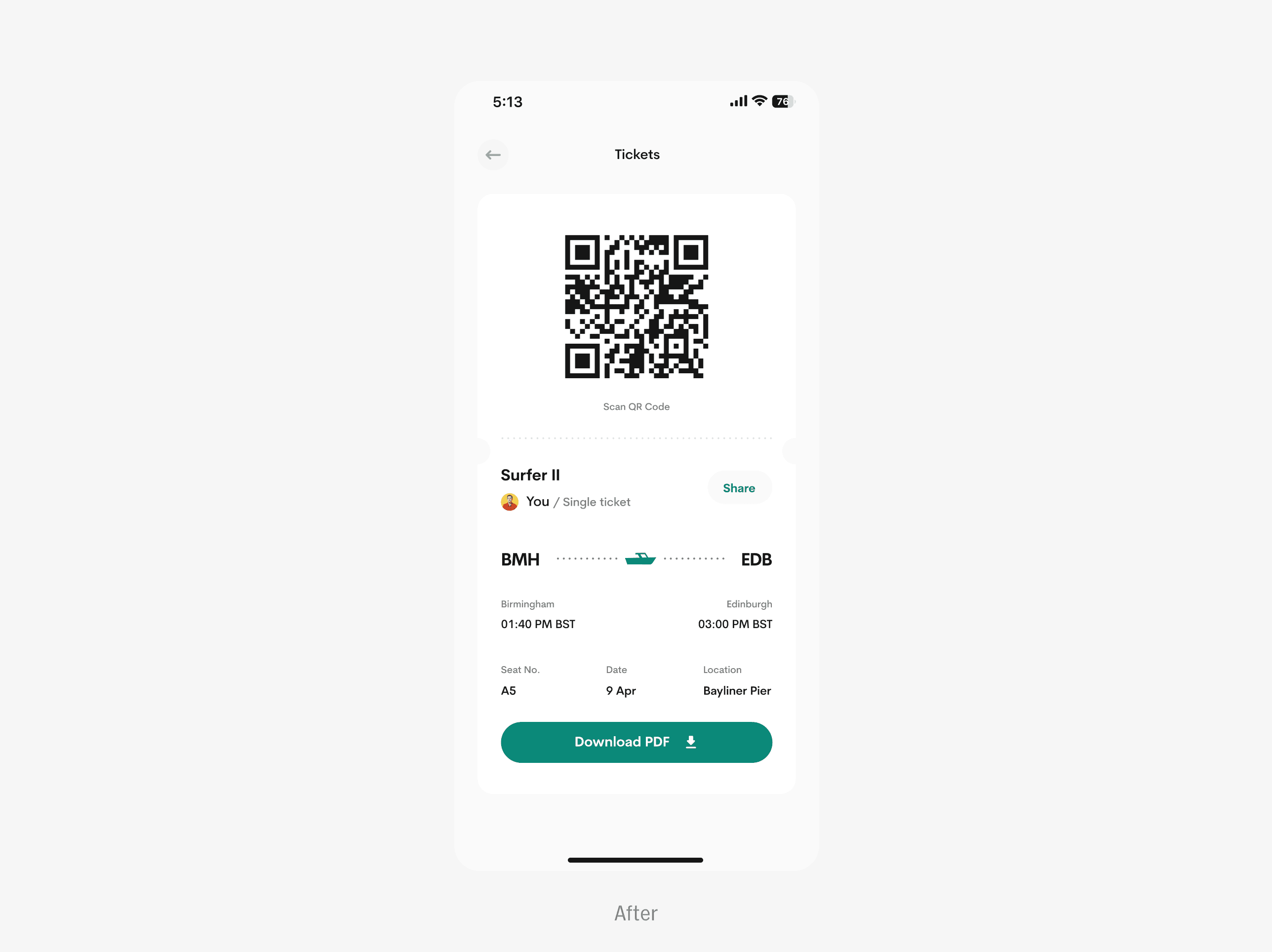
ACCESS YOUR TICKET ONLINE AND OFFLINE
I added a “download” button to enable users to download and access their tickets offline and on the go.

Bonus deliverables
I am always excited and committed to exceeding client expectations by providing additional bonuses in every project, which are always warmly and greatly appreciated.
APPSTORE SCREENSHOTS FOR IRRESTIBLE CONVERSATIONS
I enticed users to download the product with captivating screenshots that highlight its unique selling points and irresistible functionality.
SELECTING DEFAULT APP ICON
I made users in charge of their app icon aesthetics, just as an extra bonus and this was largely praised by clients.

Choose what app icon matches your style and energy.
Final thoughts and learnings
Ultimately, the process taught me the balance between creativity and functionality, how to prioritize user needs without compromising on aesthetics, and how iterative testing and feedback play a crucial role in creating a truly effective redesign.
The design process was both rigorous and exhilarating, allowing me to fully unleash my creativity and exceed client expectations. The product will continue to undergo iterative improvements with user feedback, ensuring inclusivity and equity-based satisfaction.
Thank you for cruising by.
“Traveling — it leaves you speechless, then turns you into a storyteller.”
- Ibn Battuta
INTRODUCTION
Seascape is a user-centered ferry booking and sea travel app designed to improve the way users discover, plan, and experience maritime journeys. This project addresses key user pain points such as difficulty in accessing real-time ferry information, inefficient booking processes, and lack of accessible, intuitive interfaces for diverse user groups.
BACKGROUND
The application is a platform that enables users to book and travel by sea seamlessly.
PROBLEM STATEMENT
There is a significant lack of intuitive booking platforms that support sea faring making that service very inaccessible for alot of users.
RESEARCH & USER INSIGHTS
The goal was to directly connect with our prospective end users to ascertain their painpoints. An interview was conducted with all the selected participants to individually to avoid group-thinking or the bandwagon effect.
As I built the product from scratch, I sought to gather user insights, preferences, and expectations to craft a robust offering that surpasses their anticipations.
VISUALISING THE LOGO
I crafted a logo that subtly reflects Seascape’s essence, ensuring users intuitively connect with our product. The logo concept offers a whimsical depiction of a boat viewed from a dynamic 45-degree angle, complemented by a clear and easily readable typeface.
CREATING WIREFRAMES
I crafted detailed UI wireframes to illustrate the app's structure, navigation, and key interactions, ensuring a user-friendly and intuitive design.
User onboarding
The onboarding page was designed to be simple and straightforward, swiftly introducing users to the product and its functionality. Users are prompted to provide essential biodata details, like email addresses, phone numbers, and full name.
Users are immediately encouraged to enable notification reminders during signup to ensure they are always updated about their trips.
Home screen
The home screen underwent meticulous design, offering users essential features with an intuitive navigation system, complemented by a convenient hamburger menu for additional options.
I made an intriguing decision to prominently display active bookings on the home screen, ensuring users are continuously reminded of their upcoming trips and pertinent details.
Travel digests, or reads, offer users bite-sized educational content and articles.
Dive into a world of sea travel, encompassing safety tips, life hacks, and expert guides curated by Seascape and its stakeholders.
Booking a trip
The booking process is very simple and straightforward. Users have access to view trip details, map direction, boat amenities and much more.
I provided a simple checkout process with the ability to select payment types with saving cards feature which makes consecutive checkouts more seamless.
Keeping track of your current journey
I created a thoughtful feature called Journey tracking, which offer users additional insights into their ongoing trips, including travel time, estimated distance, and boat details. Users can effortlessly share their live locations with loved ones, summon stewards, and delve into engaging travel digests throughout their journey.
VISUAL DURATION FEEDBACK INDICATOR
The miniature boat dynamically adjusts its size, inversely proportional to the trip duration, while also displaying estimated time and duration on tap.
APPLE DYNAMIC ISLAND INTEGRATED
I strived to enhance the user experience with Seascape, focusing on personalised interactions. With seamless integration with dynamic island, users stay informed about their trips, even without the app open.
Usability Testing
The primary goal of the usability test was to ensure the app seamlessly aligns with our users' needs, delivering a deeply satisfying experience. I conducted this process using Maze.
STUDY OVERVIEW
I spearheaded the Usability plan for Seascape, overseeing its execution over a 3-day period.
I welcomed participants, explaining the study's objectives, and closely observed their behaviours & micro-reactions as they navigated through each task. We ran the testing session over Google meet.
KEY PERFORMANCE INDICATORS (KPIs)
I utilised several key metrics to gauge both the effectiveness and user-friendliness of the product.
TASK SUCCESS RATE
I measured task success rates across various user tasks, setting the KPI for this metric at a minimum of 65%. Remarkably, the actual success rate averaged an impressive 91%.
USER SATISFACTION
I gauged user satisfaction via a 5-point Likert scale (1 - Very Dissatisfied to 5 - Very Satisfied), aiming for a KPI of 4.5. Remarkably, the actual average rating surpassed expectations at 4.6.
TIME TAKEN ON TASK
I established the time on task KPI to ensure tasks were completed promptly. Efficiency was gauged by adherence to designated time limits.
See full reports on the behance case study.
Solving UX Problems
I compiled the reservations and recommendations gathered from users and customized them to meet their individual needs.
REDEFINED SEARCH EXPERIENCE
I empowered users to elevate their search experience with customisable filters that refine results to perfection.
IMPROVED JOURNEY TRACKING EXPERIENCE
In addition to journey tracking, I empowered users to conveniently perform other helpful actions that foster a safer and more personalised trip.
ACCESS YOUR TICKET ONLINE AND OFFLINE
I added a “download” button to enable users to download and access their tickets offline and on the go.
Bonus deliverables
I am always excited and committed to exceeding client expectations by providing additional bonuses in every project, which are always warmly and greatly appreciated.
APPSTORE SCREENSHOTS FOR IRRESTIBLE CONVERSATIONS
I enticed users to download the product with captivating screenshots that highlight its unique selling points and irresistible functionality.
SELECTING DEFAULT APP ICON
I made users in charge of their app icon aesthetics, just as an extra bonus and this was largely praised by clients.
Choose what app icon matches your style and energy.
Final thoughts and learnings
Ultimately, the process taught me the balance between creativity and functionality, how to prioritize user needs without compromising on aesthetics, and how iterative testing and feedback play a crucial role in creating a truly effective redesign.
The design process was both rigorous and exhilarating, allowing me to fully unleash my creativity and exceed client expectations. The product will continue to undergo iterative improvements with user feedback, ensuring inclusivity and equity-based satisfaction.
Thank you for cruising by.